IELTS Academic Writing Task 1
IELTS Academic Writing Task 1 Samples
Prepare for the IELTS Academic Test by using this collection of IELTS Academic Writing Task 1 practice samples. This collection is a great way to gain insight and practice for the exam.
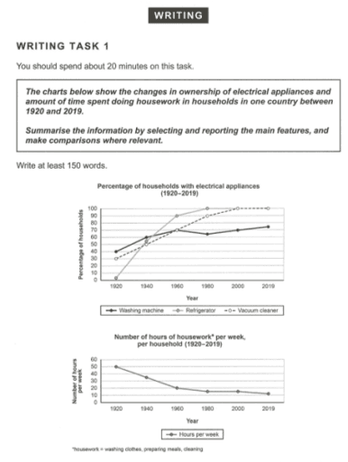
The given line graphs illustrate how much percentage three kinds of electrical products which support household chores account for and how many hours per week people spent for doing houseworks between 1920 and 2019.

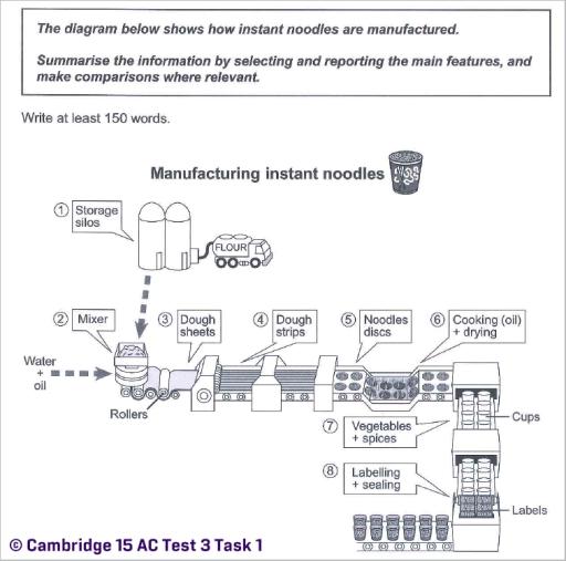
The process diagram below illustrates how instant noodles are manufactured.

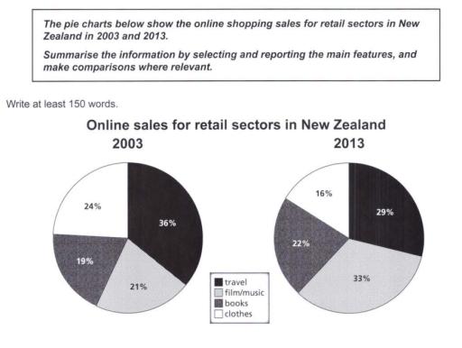
The pie chart compares to change habits to buy online goods in four section including, film/music, books, clothes and travel in 2003 and 2013, over a decade in individual country, New Zealand, overall spending on cultural items started to dominate the sector in 2013 whereas clothes and travel was the leader of the sector in 2003.


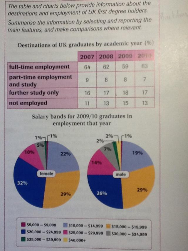
The table chart presents percent of graduates working in four diffrent employment types during 4 years. While, the pie charts demonstrate amount of payments of two genders in 2009 and 2010.

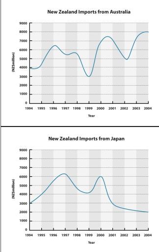
The two line graphs provide statistics about how many imports New Zealand buys from the two different countries between 1994 and 2004. Units are measured in millions of dollars.

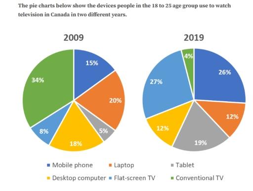
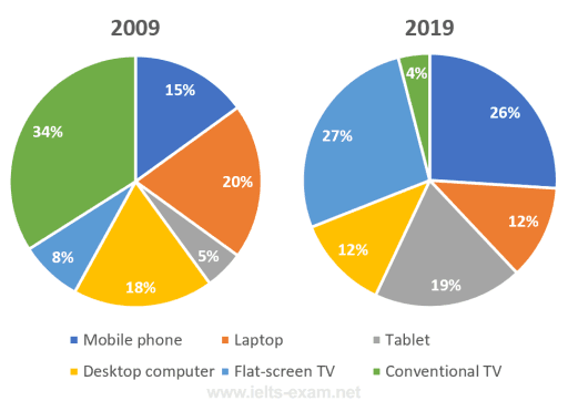
The pie charts illustrate the proportion of devices people between the ages of 18 to 25 years old utilized to watch TV programs in Canada in the years 2009 and 2019.


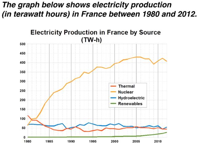
The line graph gives us information about produced electricity of four kinds of sources (Thermal, Nuclear, Hydroelectric, Renewables) in 40 years starting from 1980 in France. Unit is measured in terawatt hours.

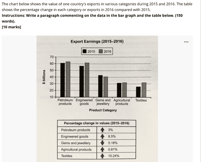
The charts illustrate the utility of a nation’s exports in different classifications and the ratio changes in every category in 2016 compared to 2015.

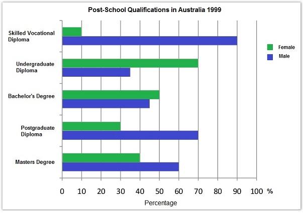
The bar charts illustrate the different levels of both male and female students' qualifications in Australia in the year 1999. The unit on the X-axis is shown in percent.

the diagram illustrates how much people in 18 to 25 age used different devices to watch television in Canada in 2009 and 2019.

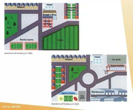
The maps depict the significant changes of the outskirts of Fosbury town over the 35-year period from 1980 to 2015.

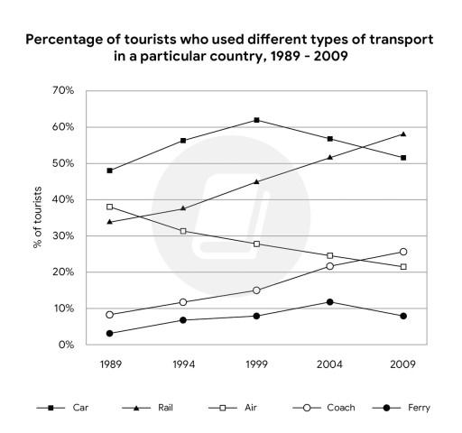
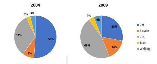
The chart depicts the proportion of people who traveled in a certain nation by using different ways of transport from 1989 to 2009.

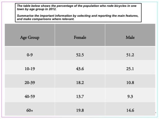
the table illustrates the percentage of people who did bicycling in 2011 in a town and classified them on different groups according to their age.

The given two pie charts illustrate the devices each between 18 and 25 age types utilized to watch TV channels in Canada in the years 2009 and 2019.

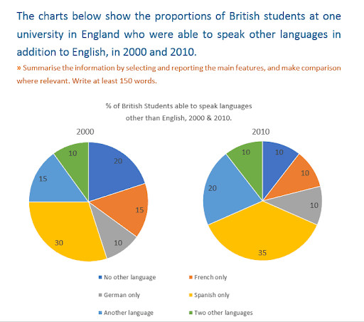
The two pie charts provide information about the percentages of British pupils who can speak different languages besides English at a particular university in England in 2000 and 2010.

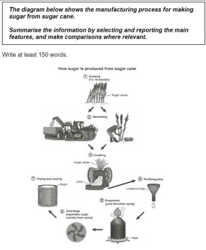
The diagram indicates the manufacturing process for making sugar from sugarcane within seven steps by machines and man-made.

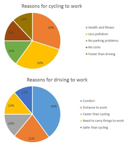
The given chart illustrates the vehicles of people go to work and the cause of of this. Overall, the first chart shows the reasons why people go to work by bicycle. And conversely, the second chart gives reasons for those who drive to work.

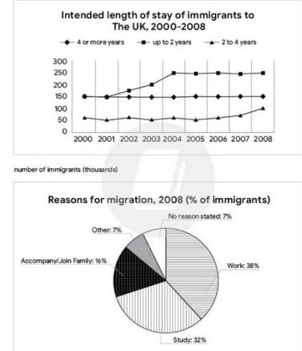
The line graph illustrates the total of the UK migrated people during 2000 - 2008/ from 2000 to 2008 and the pie chart depicts the reason they moved to the UK in 2008.


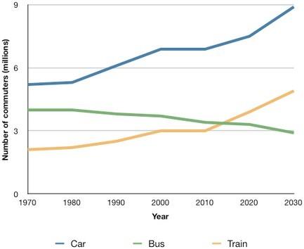
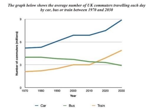
The line graph shows data on how many people utilized cars, buses and trains to go to job between 1970 and 2030.Units are measured in millions.

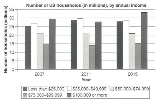
The given bar chart illustrates how much each family in American houses made in the years 2007, 2011, and eventually in 2015.

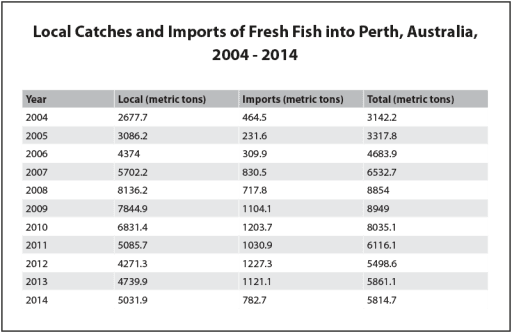
The given table depicts the figures for fresh fish from local and overseas sources in a city in Australia, called Perth, between 2004 and 2014. The values are shown in metric tons. Overall, the amount of total fish presented an increase until 2009, when it decreased to the same level in 2006/2007.

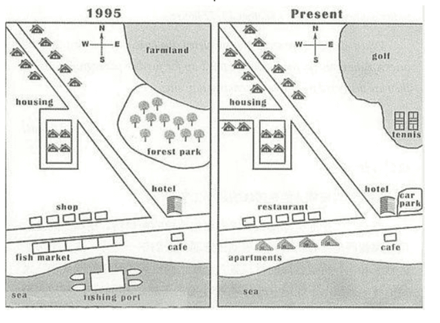
The map illustrates the improvement of the village of Rye Mouth from 1995 to the present. Overall, the village has been transformed and developed significantly, with dramatic increase in dwelling areas. Moreover, greener areas have been reduced.


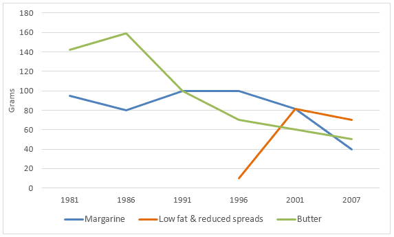
The given graph illustrates the daily intake of three spreads per person between 1981 and 2007 in a country. Overall, margarine showed a fluctuation while butter depicts a downward trend after 1986.

The two pie charts provide information about why human beings use vehicles or bikes when they are going to graft.

8.5
band
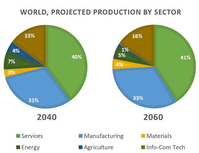
The pie charts provide key information about the prediction of the change in international production by various sectors between the years 2040 and 2060, with units measured in percentage of total production.

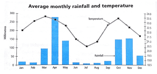
As for the weather circumstances in the East region of Africa, a glance at the figure provided reveals some data. While the line graph illustrates the mean monthly temperature, the bar chart gives information about the average monthly precipitation.

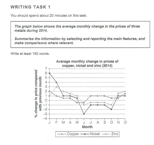
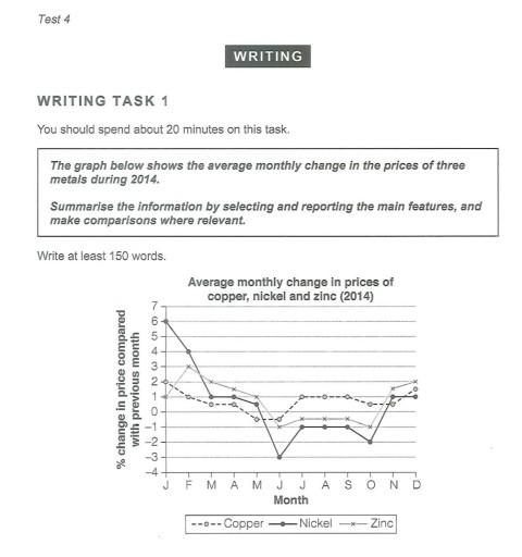
The graph shows information about the amount of average monuthly change prices which was changed of the three metals during 2014.


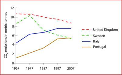
The line graph shows that how much carbon dioxide (CO2) was produced and its average amount per person in four countries, namely, the United Kingdom, Sweden, Italy and Portugal from 1967 to 2007.

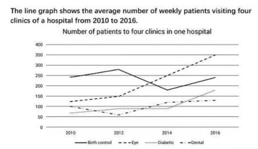
The line graph shows the typical weekly data of visitors who saw the doctor in four different clinics of a hospital between 2010 and 2016.

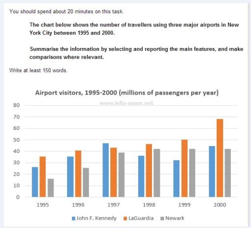
The bar graph illustrates how many people prefer to New York City's three main airports including John F. Kennedt, LaGuardia and Newark over a six-year period between 1995 to 2000. Overall, Laguarda followed to upwarand trend beside the other main airports

The pie charts depict data about devices used to watch TV programs among teenagers under the age of 25, in Canada, from 2009 to 2019.

The graph provides us information about domestic access to four modern technology in the last decades.

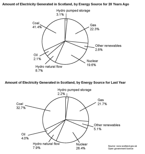
The pie graphs depict the amount of produced electricity by distinctive resources 20 years before and a year ago in Scotland.

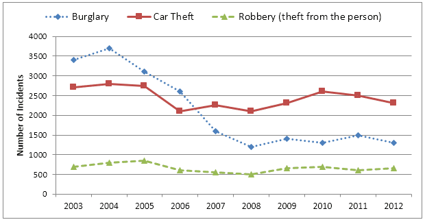
The provided line graph show us information about the number of crimes which occured in three diffrent categories in Newport city within a decade starting from 2003. At first glance, amount of burglary went down rapidly while car theft and robbery remained stable over the period.

The two pie graphs illustrate how Canadian teenagers and young adults watched their TV programs in 2009 and 2019.
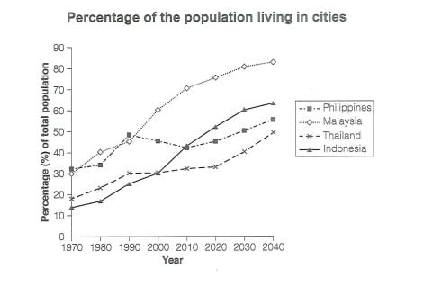
The graph shows percentage of population who lived in cities of South-east Asian countries including Philippines, Malaysia, Thailand, and Indonesia from 1970 to 2020, also the predictions for 2030 to 2040.

The provided line graph gives us information about the number of British people commuting to work by three vehicles within a half-century starting from 1970. At first glance, while trains and cars went upward gradually, the number of buses moved down slightly.

The provided diagram illustrates how the village of Rye Mouth went through various changes from the year 1995 until the present time.
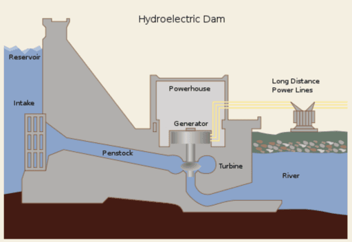
The diagram illustrates how the production of hydroelectricity works.

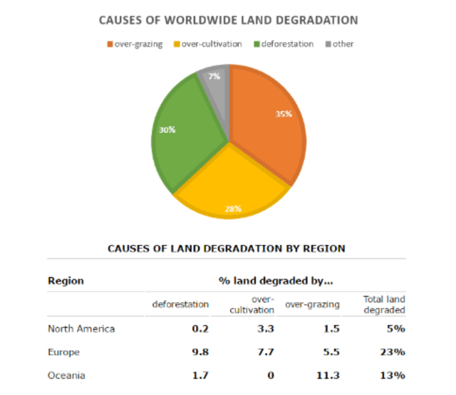
The pie chart illustrates the crucial reasons why agricultural place becomes less productive, while the table compares causes and affected three variety areas of the world during 1990s.

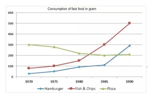
The line graph illustrates eating of 3 variety types of fast food in Britain between 1970 and 1990.

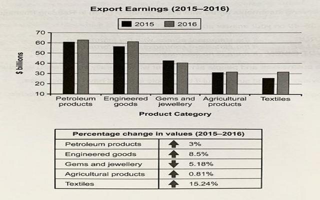
The Export Earnings of one company in 2015-2016 are illustrated in the graph accompanied by a table showing a numerical comparison between the years 2015 and 2016.

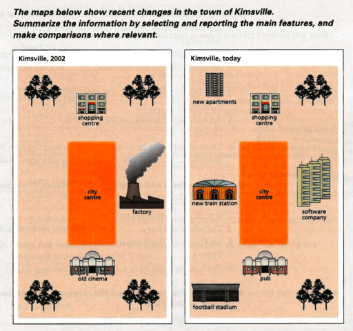
The provided maps illustrate how the town of Kimsville changed over a twenty-year period between 2002 and 2024.

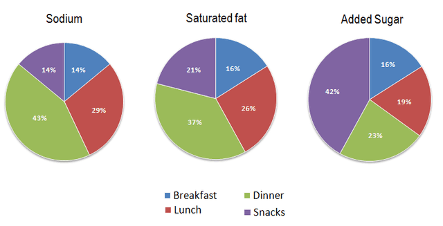
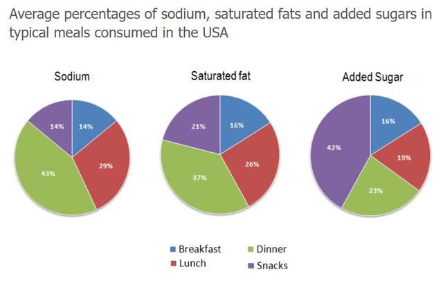
The charts illustrate that the average person gets nutrients in a ratio of different types in every meal and snack in everyday life in the USA and it may be caused by unhealthy intake a lot.

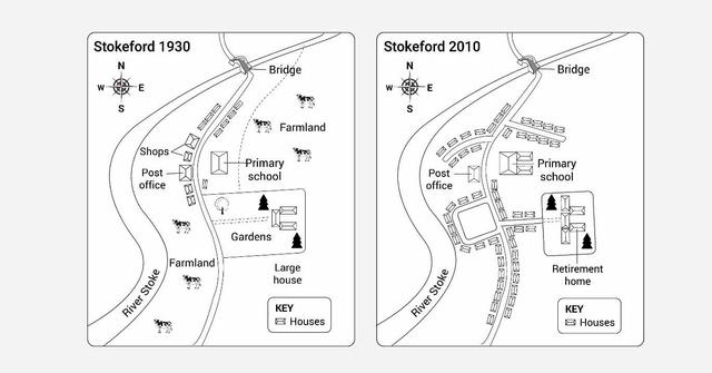
The maps illustrate how a village called Stokeford has developed in 1930 and in 2010.

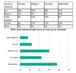
The table provides statistics about the various modes of transport in four countries, units measured in percentages, and the bar graph gives information about why people opt to utilize cars in Canada.

The given line graph illustrates how the costs of copper, nickel and zinc varied in 2014. Overall, it can be seen that both copper and zinc witnessed a slight rise in their prices while Nikel’s value decreased significantly during the selected year.

The diagram delineates the transformation of Rye Village from 1995 until recently.

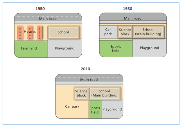
The given maps illustrate the changes in facilities at West Park Secondary School in three periods (years 1950, 1980, and 2010).

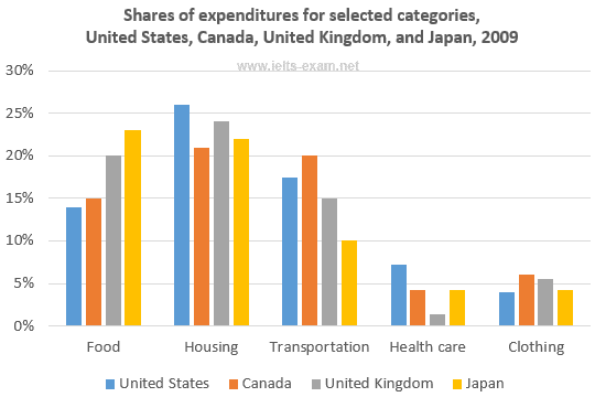
The bar chart illustrates shares of expenditures for five categories (Food, Housing, Transportation, Health care, and Clothing) in different countries ( United States, Canada, United Kingdom, and Japan) in 2009. Overall, it is seen that shares of expenditures for housing, food, and transportation in all given counties showed high rate compared the categories for health care and clothing.

The pie charts depicts the percentage of using different gadgets in Canada by age of 18 to 25 in 2009 and 2019.

The two pie charts compare the cutting-edge technologies by Canadians aged 18 to 25 years old to facilitate TV channels that were recorded between 2009 and 2019. Overall, it is noticeable that the figures show an upward and downward pattern during observations. In addition, while, the number of tablet lovers increased, the old TV actually went downhill at the end of the period.

The diagrams below show the gadgets used to watch TV channels in Canada in 2009 and 2019 amongst adolescents under 25.

7
band
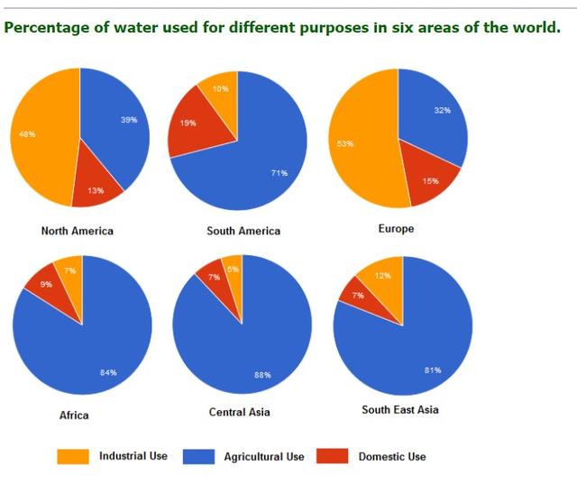
The pie charts give information about the proportion of water consumption for three types of purposes in different areas around the world.

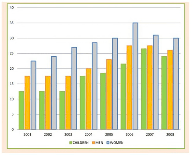
The bar chart provides a detailed breakdown of the proportions of daily fruit and vegetable consumption among UK citizens categorized by children, men, and women from 2001 to 2008.

The maps illustrate the comparison of the village and area around itself at Rye mouth between the year 1995 and the present.

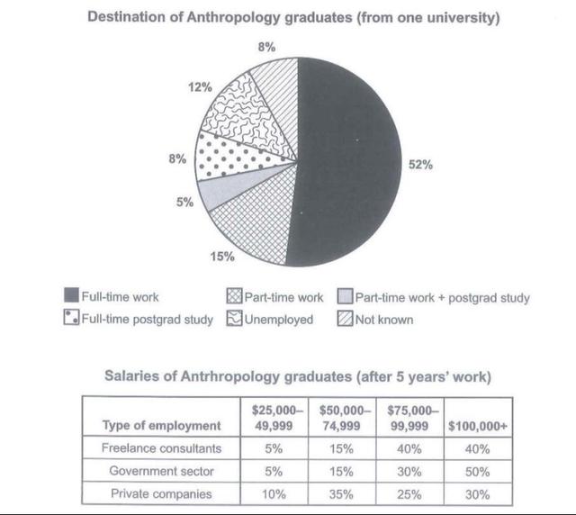
The chart shown provides data about Anthropology degree holders’ careers and the table illustrates their income after five years.

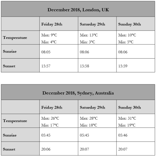
The tables given depict several pieces of data regarding temperatures and hours of daytime in Mumbai and Moscow in the same week in May 2007.

The pie chart illustrates data on the various modes of transportation that people generally use to get to university between 2004 and 2009.

A glance at the two maps provides the changes of the Village of Rye mouth between 1995 and present.

The graph depicted above provides the monthly average price fluctuations of copper, nickel and zinc throughout the year 2014.

7
band
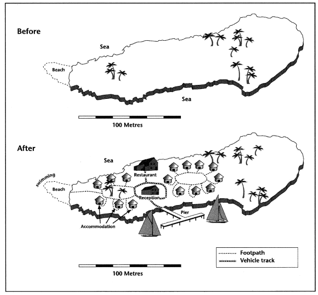
The two provided maps depict the development of an island before and after the establishment of tourist attractions.

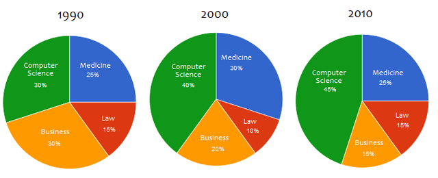
The given three pie charts show degrees granted in four sectors at the National University in 30 years(1999, 2000, and 2010). Overall, we can see that computer science degrees holders comprised the most over three decades. Moreover, there was a slight fluctuation on the popularity of medicine and law.

A glance at the two pie charts provides the proportion of five gadgets including mobile phones, laptops, tablets, desktop computers, flat-screen TVs and conventional TVs Canadians in the 18 to 25 age categories used to watch TV in 2009 and 2019.

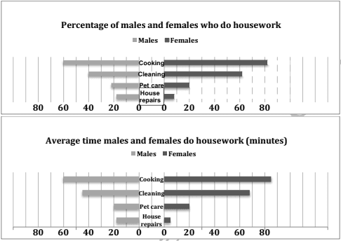
The given charts display information on the percentages and time spent by males and females in the associated 4 types of house chores.

The bar chart compares a particular country's income from exports in several categories between two years, 2015 and 2016, whereas the table adds information about the percentage difference in each category. The categories are petroleum products, engineered goods, gems and jewellery, agricultural products, and textiles.

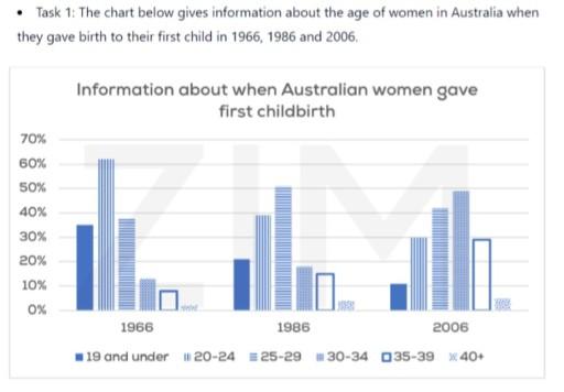
The given bar chart provides statistics on how old Australian mothers first have their child from the year 1966 to 2006.

The map compares the design of the village of Rye Mouth from 1995 to the present.

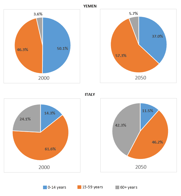
the given chart depicts the percentage of populations of Yemen and Italy in 2000 and estimates the figure in 2050.

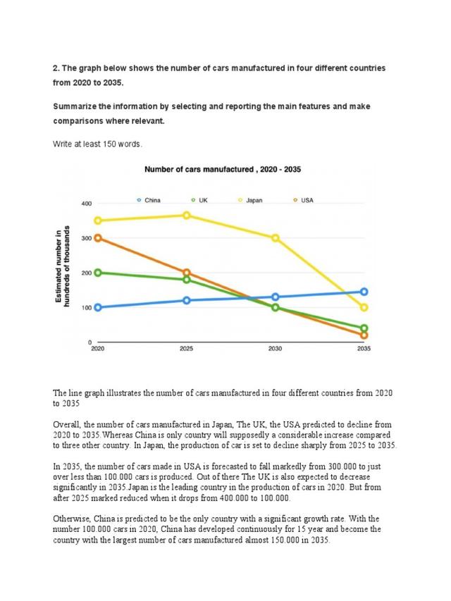
The diagram illustrates how many cars will be produced from 2020 to 2023 in China, Japan, the UK, and the USA.
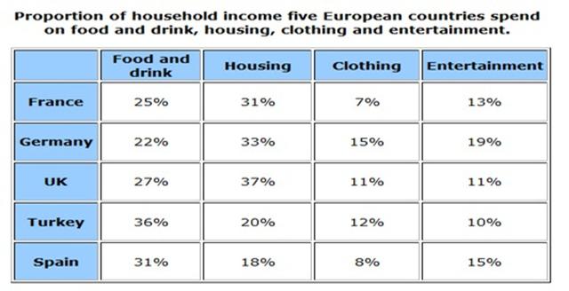
A glance at the table provides the percentage of monthly family expenditures in four sectors including food and drink, housing, clothing and entertainment in five European countries which are France, Germany, the UK,Turkey and Spain.

The line graph depicts the number in hundred of thousand cars in many countries manufactured from 2020 to 2035.

The pie charts compare online shopping in terms of spending for commercial sectors (travel, film, books, and clothes) in New Zealand over a decade from 2003 to 2013.
The pie charts compare the most important causes for students selecting a certain UK university between 1987 and 2007.


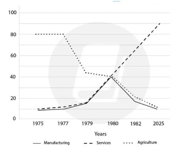
The chart illustrates the different branches of employment in the USA between 1975 and 2025. These jobs are divided into manufacturing, services, and agriculture.

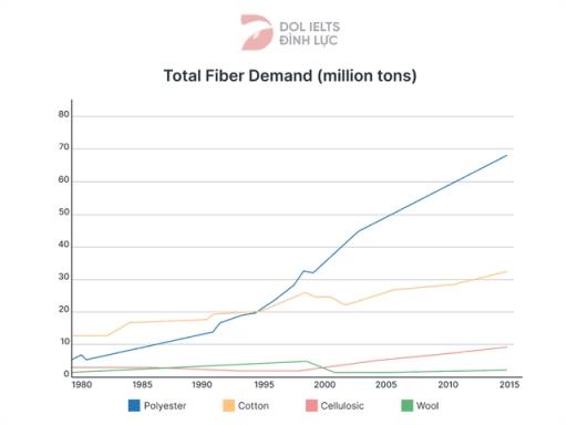
The line graph compares four items in terms of global fibre demand from 1980 to 2015.
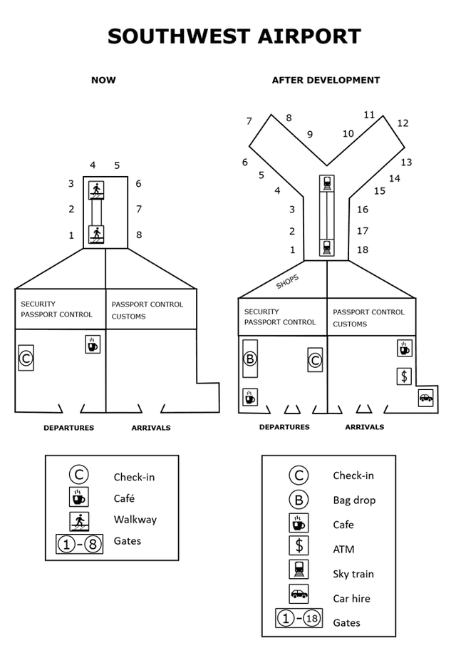
The maps provided above showcase two different layouts of current Southwest Airport and post-construction next year.

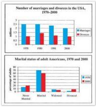
The given charts illustrate the number changing of marriage and divorce rates in the USA between 1970 and 2000, and the situation of marital in 1970 and 2000.

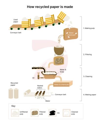
A glance at the diagram provides the flow chart for producing recycled paper.

The line graph depicts five countries tourists arival from 1995 to 2010.


The line graph illustrates the average monthly cost fluctuations of Copper, Nickel , Zinc by 2014.
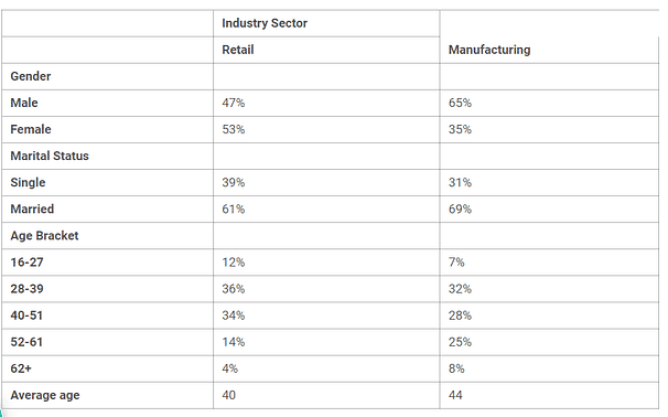
The given table illustrates workers' information who take part in retail and manufacturing companies, while categorised by their gender, marital status and age. From an overall perspective, it is evident that the majority of manual labour employees is male, and most of them are married.

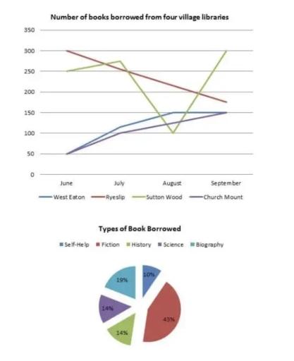
the line graph illustrate the number of books which are borrowed by people of four different village from libraries in 4 various month in 2014.

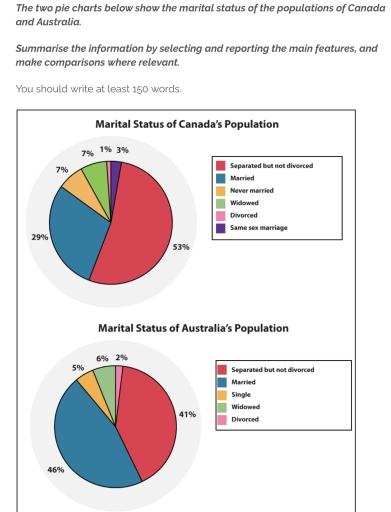
The two graphs illustrate Canada's and Australia's marital status of their habitats. Both charts are divided into four identical categories, except there are additional groups of marriage between same sex and never married people in Canada’s information. While a list of single individuals is in the chart of Australia.


The figure of two charts demonstrates the material status of the population of Canada and Australia and the population was described as the percentage. In the first chart, the status divided into 6 sections in Canada and Australia's had 5 types of sectors.
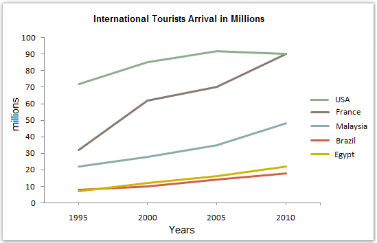
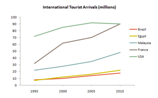
The diagram illustrates the number of global travelers who went to those countries including USA, France, Malaysia, Brazil, and Egypt from 1995 to 2010. Overall, there was experienced increased trend over a period of 15 years.

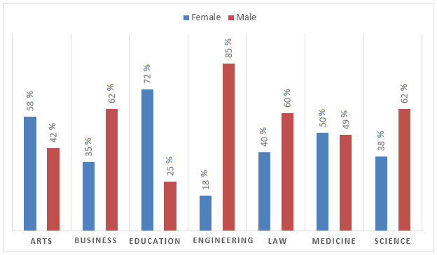
A glance at the bar chart provides the proportion of academic staff members in different genders across the departments of a major college in 2012.

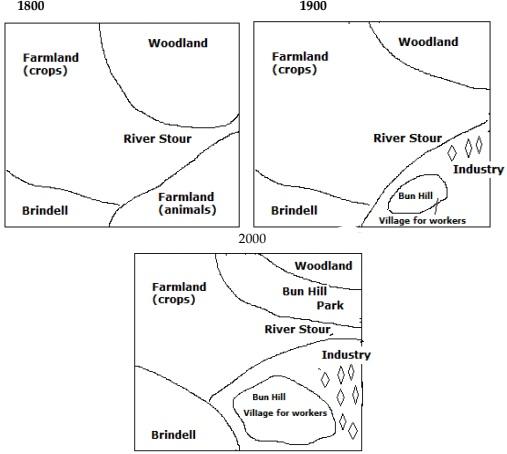
The given three different diagrams illustrate the Brindell layout and how it changed between 1800 and 2000.


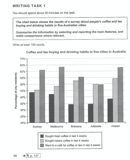
What the bar graph presents is the buying and drinking habits of Australia people in five cities.

The line graph illustrates the total of people migrating to the UK during 2000 - 2008/ from 2000 to 2008 and the pie chart depicts the reason they moved to the UK in 2008.
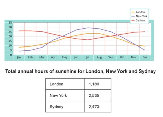
The diagrams illustrates the normal degree in these 12 months and sum hours of sunlight during a year in London, New York and Sydney. Overall, Sydney experienced opposite trend compared to London and New York.


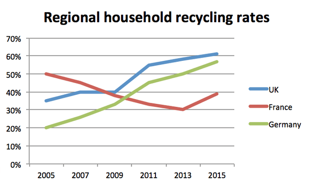
A glance at the line chart provides the percentage of household recycling in three different countries in Europe including the UK, France and Germany frome 2005 to 2015.

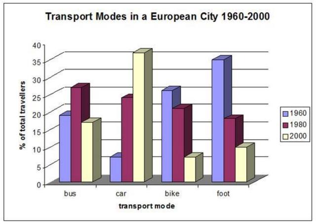
The given chart illustrates four types of transportation between 1960 and 2000 that citizens commuted to work and travel in a European city.

The given live graph demonstrates average monthly temperatures, where as the tablechart illustrates total annual hours of sunshine for London, New York and Sydney.
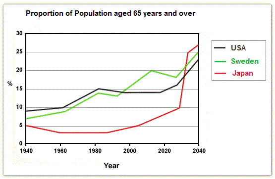
The given line graph illustrates Percentage of People aged 65 and over from Period of 1940 and also Predict for 2040.

The set of pie charts presents a picture of three ingredients in the US's meal consumption.

The three maps indicate their transformation in some areas such as farmland, river, brindell, animal habitats and woodland between 1800, 1900 and 2000. Overall, there has been a big change for three centuries, just only crop farmland has constantly remained in the three centuries.
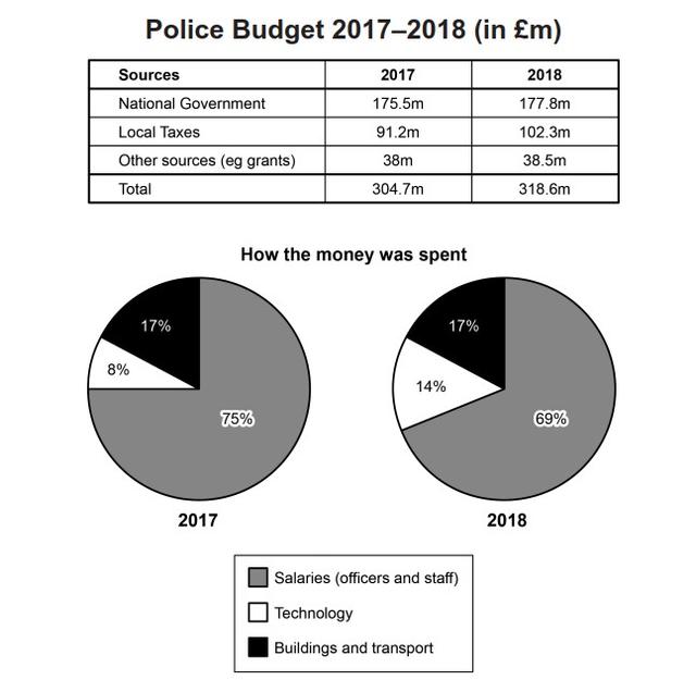
The table shows the three sources (national government, local taxes, other sources) and the total amount in one area of the UK police budget for 2017 and 2018. While the pie chart illustrates the percentages of three different money uses in 2017 and 2018 (wages, technology, construction, and transportation). Units are measured in British Pound.

The given chart illustrates how international tourists arrived in five countries namely the USA, France, Malaysia, Brazil and Egypt.Overall, I see the number of tourists in the USA is the highest in the whole process. The rest of the tourist arrivals in these countries increased over time.

"The provided chart illustrates the influx of international guests in five different nations from 1995 to 2010.
Unlock the Full Potential of Writing9
- Unlimited Essay Checks: Practice and perfect your skills.
- Detailed Error Analysis: Spot every mistake.
- In-Built Grammar Checker: Say no to grammatical errors.
- Personalized Suggestions: Know how to boost your score.
- Progress Tracking: View your checked essay history.
- Still thinking? We have a 14-day money-back guarantee. Take a leap of faith!